
.svg)


A case study redesigning website for PRIDEnet - the volunteer and community engagement sector of the PRIDE study.

PRODUCT DESIGNER
2 months
A case study redesigning website for PRIDEnet - the volunteer and community engagement sector of the PRIDE study.
Otsuka was setting up a new division called the Data Tech and Analytics team which would handle the complete development of dashboards pertaining to patient profiles and clinical trial operations.
Data Tech and Analytic Solution (DTAS) Team
Product Manager
Developers
More than 250+ Dashboards for clinical trial reports and operational activities but there is no consistency or proper accessibility.
A case study redesigning website for PRIDEnet - the volunteer and community engagement sector of the PRIDE study.
A case study redesigning website for PRIDEnet - the volunteer and community engagement sector of the PRIDE study.
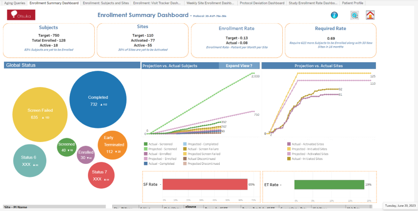
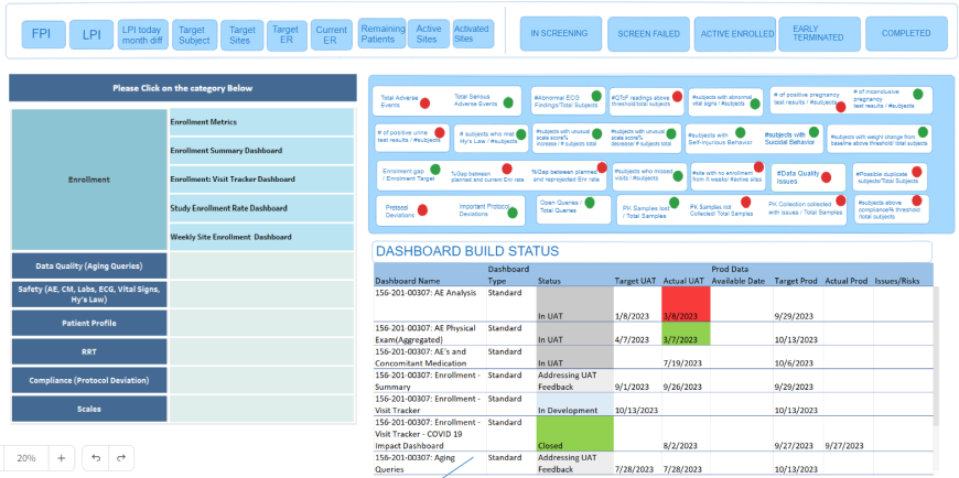
I started my research by going through all the existing dashboards, internal tools and reporting systems that were in place currently. Below are some samples.
On an average, there are more than 25 dashboards being developed simultaneously at any given time. With time constraints, each developer comprehends what the requirements are and starts putting together a set of visualizations to convey all the information at the earliest.
With the urgency of reporting clinical trial reports, there was no standard established by the Data and Analytics team to develop their reporting Dashboards.
I spoke to more than 10 members of the engineering team, product managers and other stakeholders to understand the root cause of the problem and understand their pain points.
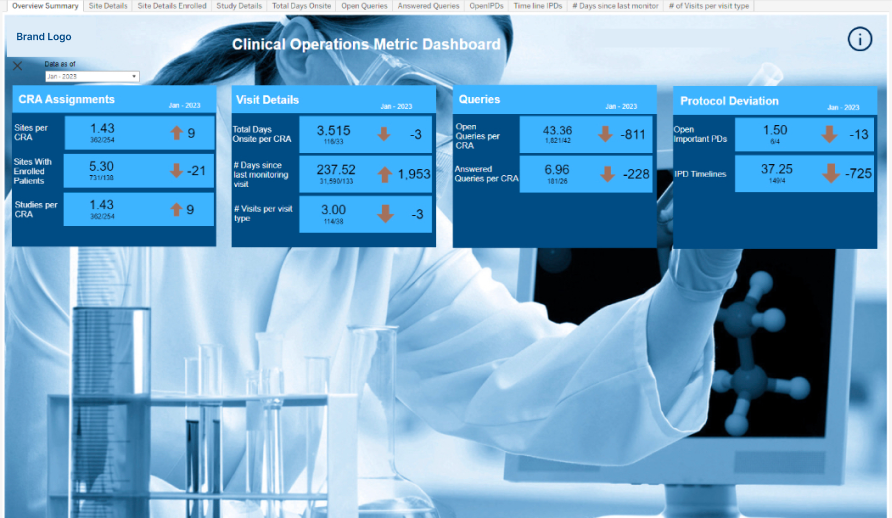
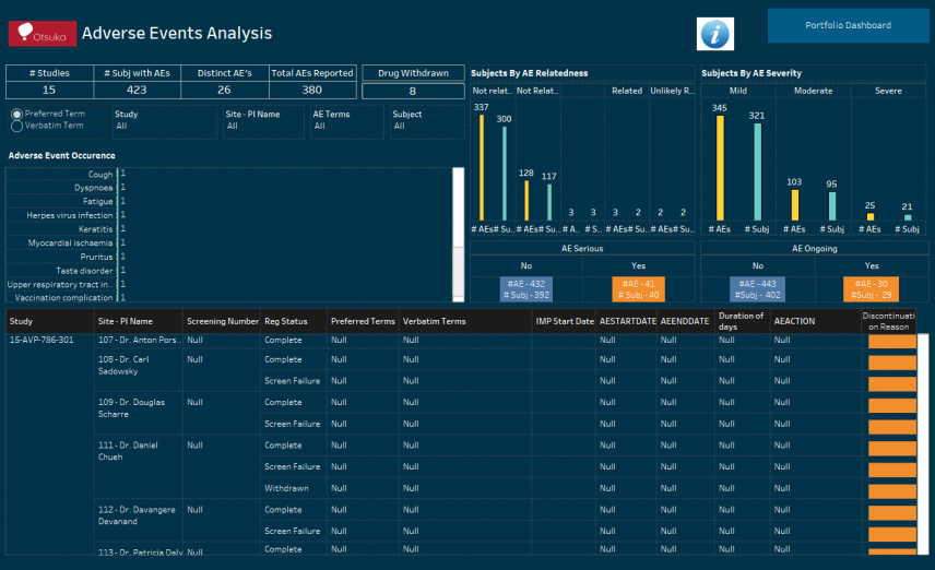
Samples of existing dashboards - Lacking standards in format, color schemes and layouts
From Operations to Data Management and Patient Profiles, each team had developed their own set of individual Dashboards. The end users and executive teams were finding it very difficult to navigate through them all and drive decisions efficiently.
• On an average, more than 30 developers were working on developing dashboards and all of them were contract workers.
• The business gave the requirements to the engineering team directly.
• There was no designer within the team to guide them. There was an internal design system but nobody in the DNA team has access to it.
• Each developer took the liberty of designing the dashboard the way they felt represented the requirements the best without coordination with others.
They focused primarily on the data visuals as opposed to the overall navigation.
• Whenever requirements changed, the developers would work on
incorporating changes. However, if their contract had ended, someone new
was assigned with the task and they would update it based on their individual understanding and preferences.
There are 2 types of Dashboards that the Data and Analytics team develop at Otsuka.
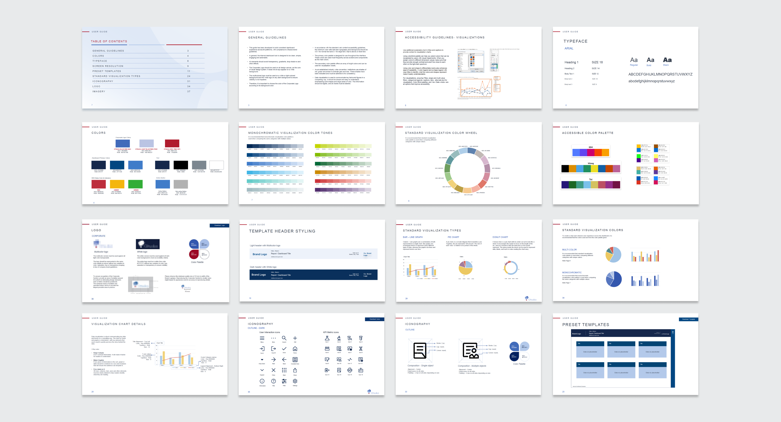
The Data and Analytics team was not aware of any brand guidelines or design system that Otsuka had. When asked if they could ask for it, they were only able to give me their brand guideline booklet. It only had guidelines for logo placements and imagery.
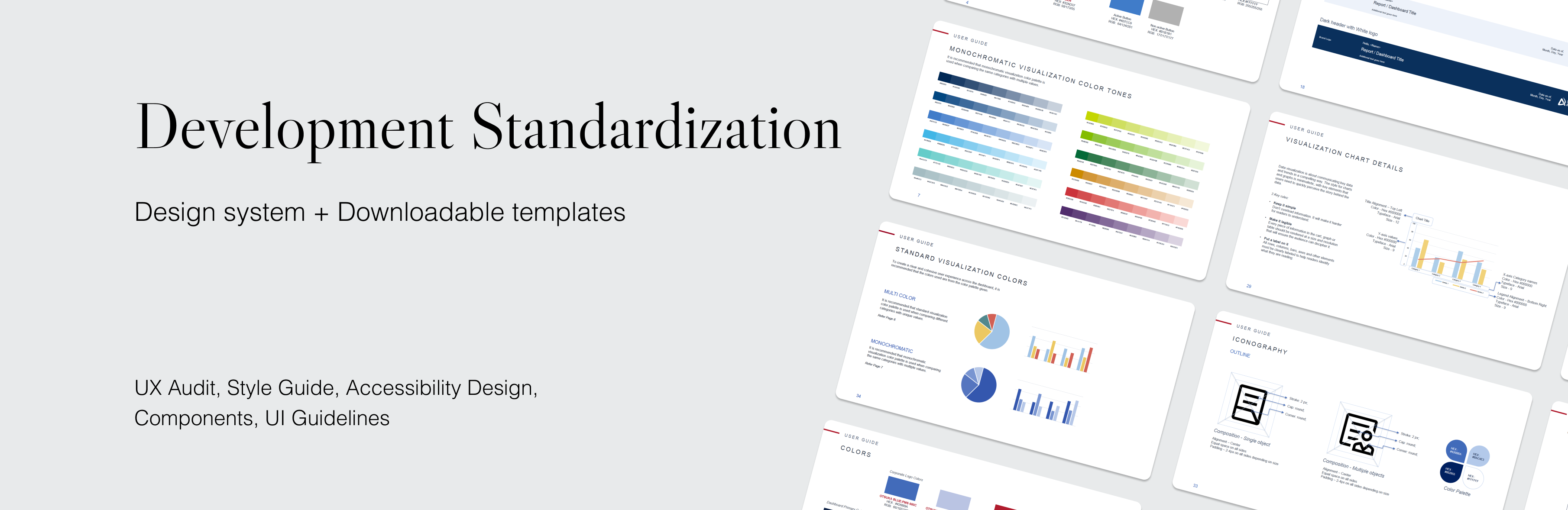
Research uncovered that almost all the dashboard were designed on Tableau. So I decided to create a guideline design system that could adapt to the Tableau development system, making it consistent, faster and efficient for developers. Users would also gain from this due to the intuitiveness and seamless experience across multiple dashboards.
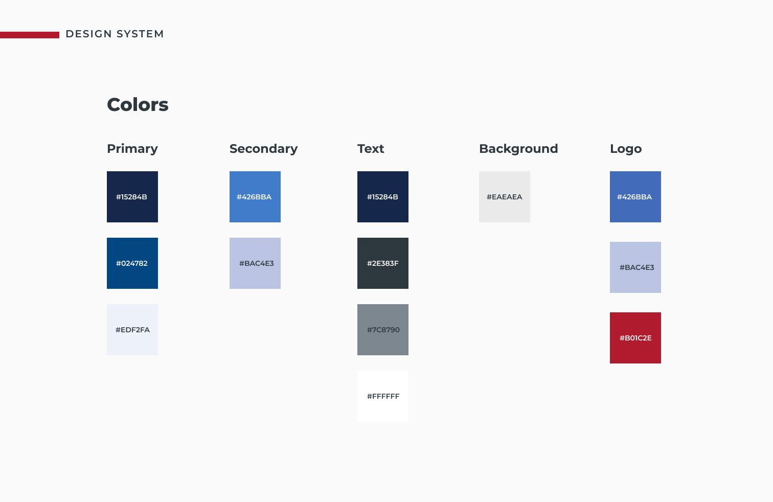
I started off by checking to see if Otsuka had an internal design system that was used for their website. I was able to get some documentation from the team but that was very restricted. It did not have many components and only showcased the basic 3 colors of the logo and specified prominence of placement of the logo along with the different color version of the same.
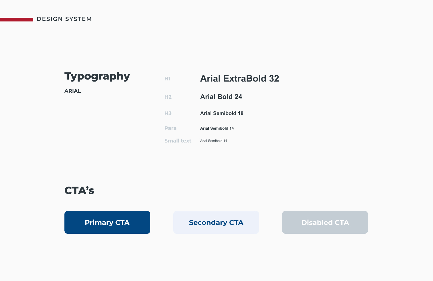
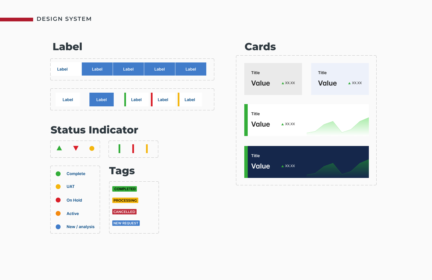
So then I started with listing out all the colors and developing an entire color scheme. Since the project was essentially on BI platforrms like Tableau and Power BI, I had to do my research and get acquainted with the basic features on the platform. I specified a very simple Typeface to ensure it would be available on all platforms. For data visualization, I implemented a varied color scheme for distinguishment among graphs.
Fun fact - For this project, there was a delay getting onboarded and I did not have access to design software like Figma or XD. Due to the urgent nature of the project, I started developing the basic design system on Microsoft powerpoint and went on to complete it on Adobe XD.
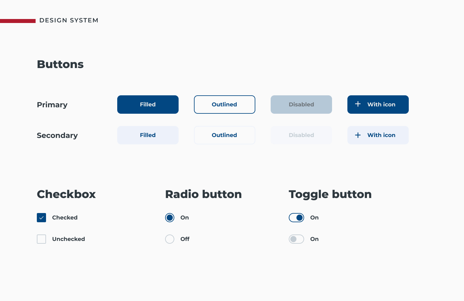
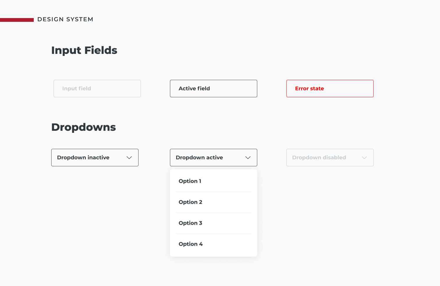
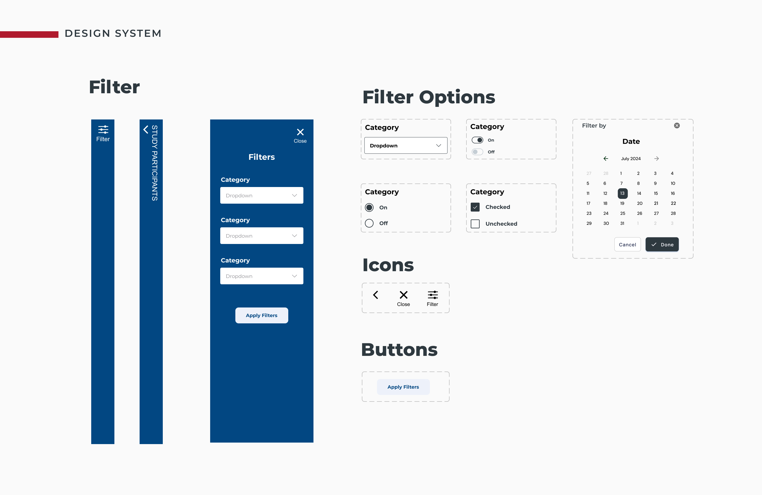
Developing Standards for the Developers in the Data and Analytics team to follow.
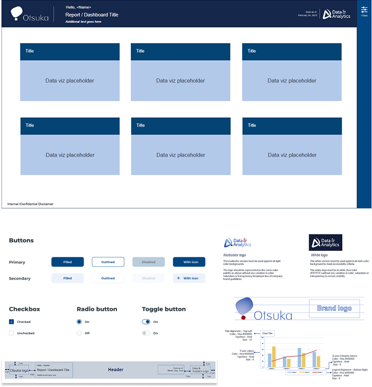
The most prominent feature - The Header since it contains the Logo, the co brand logo, title and more.

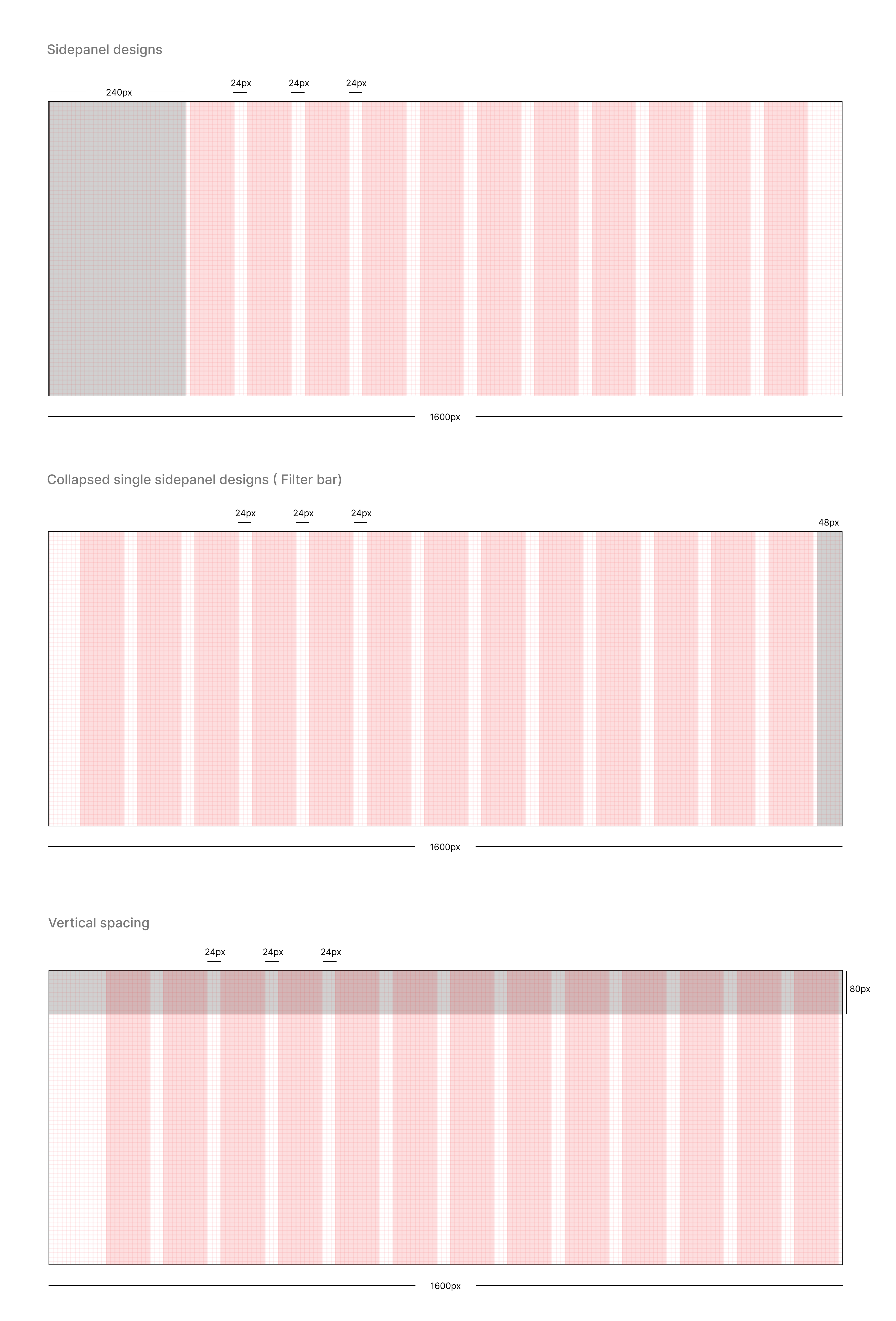
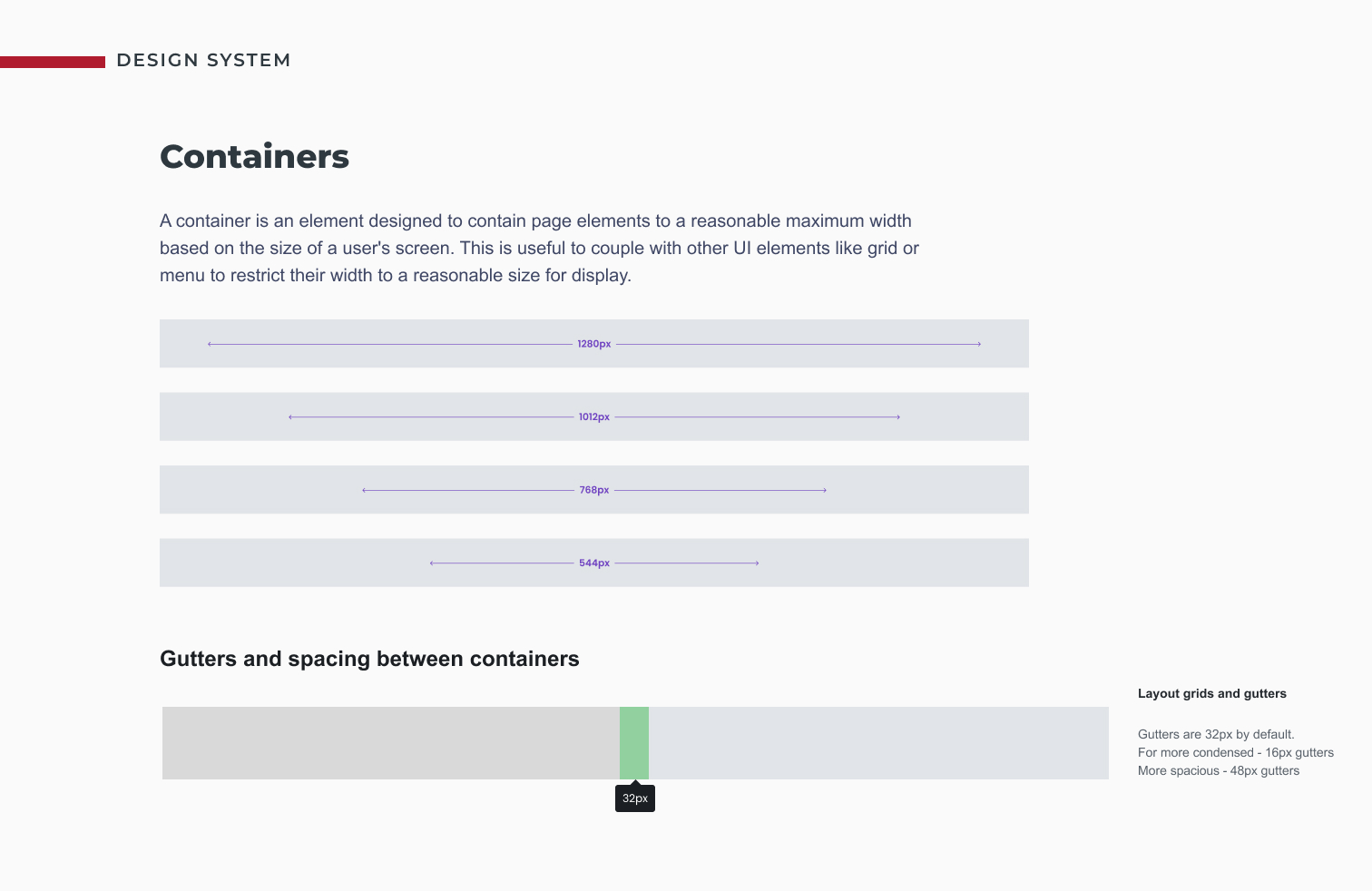
The 8 point system will be followed across all dashboards. Since the layouts will be standardized, the set grid system for side panels, filter panels and vertical header bars are indicated below.
View complete Design system >
A prominent feature that I introduced was the filter tab on the right. Inspired by the Salesforce design system, similar to the menu tab on the left for dashboards, I introduced a slim, narrow tab on the right that would expand on click. This saved the biggest problem because all the current dashboards had filters in different locations, without any consistency. This confused users and sometimes they struggled to apply the right filters required.
This method saved space, gained prominence on the homepage without taking away into the space for the data visualizations.
Once I had the design system in place, I reviewed it with all the stakeholders to see if it aligned with what they wanted for the department.
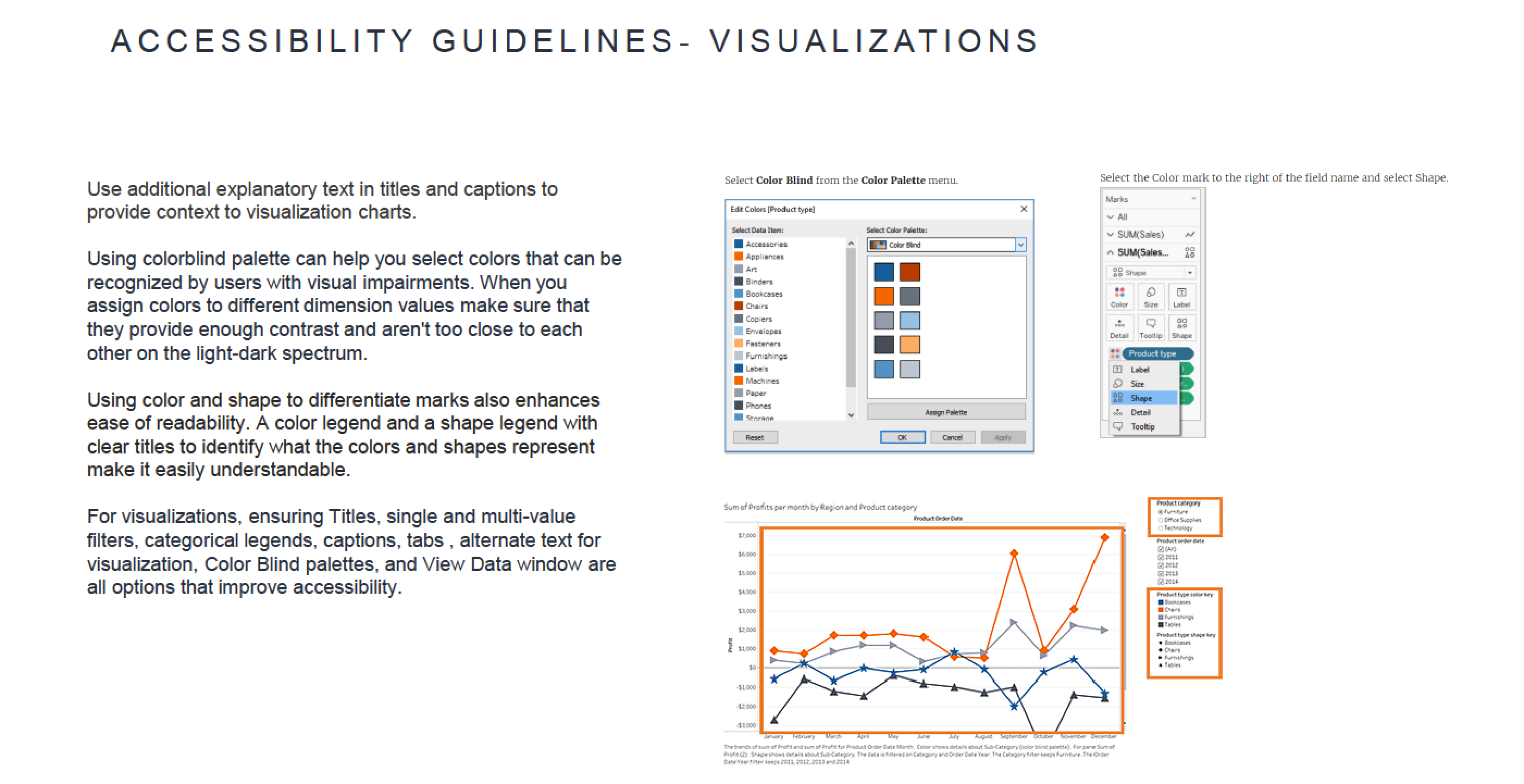
The feedback we got from them was that the wanted the color scheme to be accessible for colorblindness. With some research, I found that Tableau had a feature that allowed users to enable the colorblind mode.
Once the design system was approved by the team, I spent 2 weeks having training sessions twice a week with all the developers on the team. Since they were about 25 of them working simultaneously on various projects, I could not have 1:1 meetings with them all. This working session helped address a lot of doubts and concerns by the team to ensure everyone's onboard.
A month later, it came to my notice that the team was unhappy because even though the design system was in place, all the reports weren't synchronized. There were minute variations with sizes, alignment and more. When I investigated further, I realized that most of the time the deadline was very hectic and most developers did not have sufficient time to spend on fine-tuning their layouts. They prioritized proving the data and were unable to develop the layouts to perfection.
So, I came up with an easy solution. I spoke to the team and asked for the availability of one developer for a week. Together we spent time daily, developing a set of base templates on Tableau that the team could download an customize. This way, they saved a lot of time and had to focus on customizing only the central placeholder based on the data visualizations.
Since, they were already in the midst of developing dashboards, they didn't have the time to start from scratch. So we developed a set of templates that could be downloaded and customized for their usage.
The two different toned headers are to distinguish between The Clinical Trial Reporting Dashboards and the Operations Dashboards.
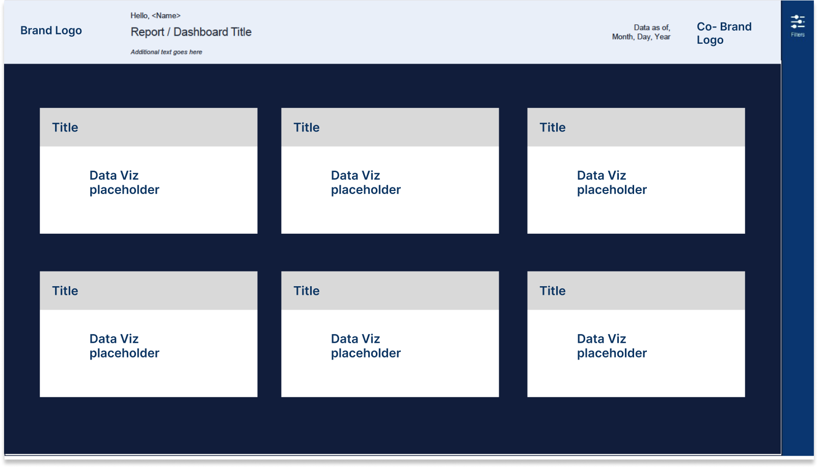
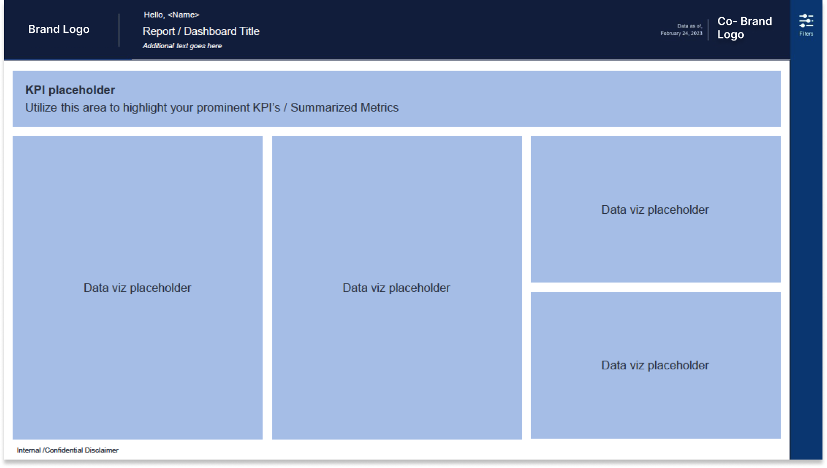
Samples of downloadable Templates developed to maintain consistency and save time.
Here are the results measured by developing the design system and having downloadable templates that can be customized.
18+
hours saved on an average per dashboard per developer
20%
time saved during development per dashboard
100%
Consistency for all new dashboards developed over 6 months
Now that we had the design system in place, we had to get into the nitty gritty of individual dashboards being created and revamp them efficiently
Once we had the templates, I focused on redesigning some important dashboards that needed attention. Below are some samples of them.
Examples of redesigned dashboards using the Design system
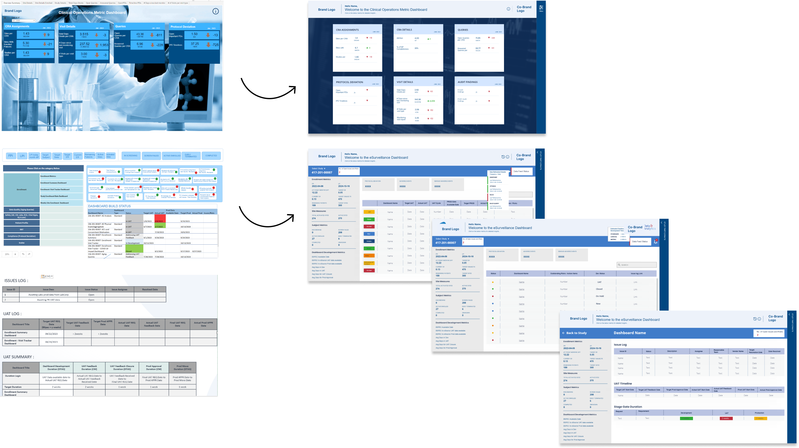
Outcomes Overview


.gif)
.gif)