.svg)


A case study redesigning website for PRIDEnet - the volunteer and community engagement sector of the PRIDE study.

Project: Clinical Trial Patient Monitoring App
Role: Lead Product Designer
Industry: Healthcare, Clinical Trials
Duration: [Insert Timeframe]
Tools Used: Figma, Adobe XD, Notion, Jira, React (for prototype testing)
PRODUCT DESIGNER
5 months
A case study redesigning website for PRIDEnet - the volunteer and community engagement sector of the PRIDE study.
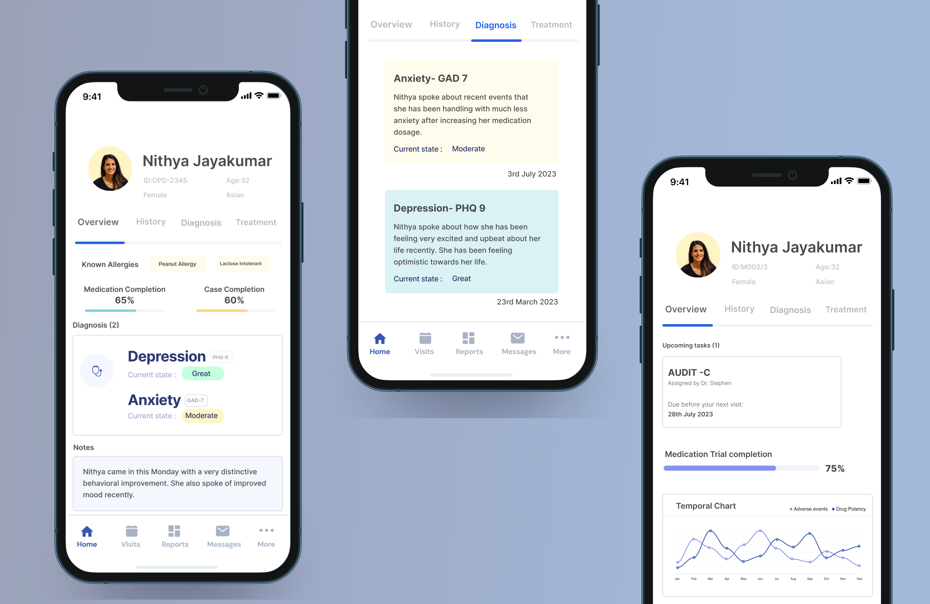
Clinical trials for drugs treating anxiety and depression require seamless interaction between patients and medical professionals. Patients need a way to track symptoms and progress, while professionals require a comprehensive dashboard to monitor responses and side effects. This project aimed to develop a mobile app for patients and a tablet dashboard for medical professionals to facilitate data-driven decision-making.
Data Tech and Analytic Solution (DTAS) Team
Global Intelligence Team(GCI)
Product Manager
Developers (15)
Scrum Master
Business Analyst
Data Scientist
An optimization system for the Data and Analytics Team at Otsuka to track their development Operations activities
The client is a global pharmaceutical company that is committed to developing new treatments in neuroscience like schizophrenia and major depressive disorder (MDD), bipolar disorder, and other neurological and neuropsychiatric conditions, including Alzheimer disease, epilepsy, attention deficit hyperactive disorder, posttraumatic stress disorder, borderline personality disorder, and autism.
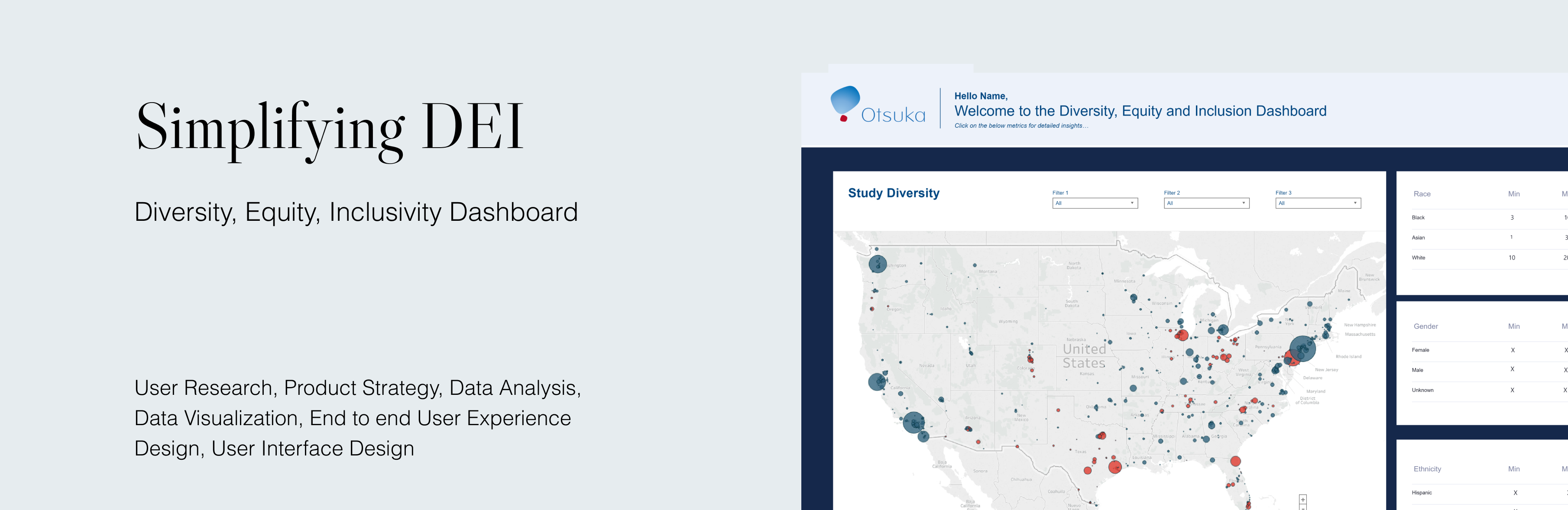
Develop a robust data optimization framework for the Data and Analytics Team at Otsuka to standardize their Dashboards and make them more accessible.
Project Manager , Developers (15) Scrum Master, Business Analyst, Data Scientist, Data Tech and Analytic Solution (DTAS) Team,
Global Intelligence Team(GCI)
Patients: Struggle to track symptoms, report side effects, and communicate efficiently with their healthcare providers.
Medical Professionals: Need real-time access to patient data, including symptoms, medication adherence, and reported side effects, to make informed decisions.
We'd have to create a two fold system that's used by medical professionals as well as patients taking part in clinical trials.
A case study redesigning website for PRIDEnet - the volunteer and community engagement sector of the PRIDE study.
Objectives
For Patients: Provide an intuitive interface to track symptoms, progress, and medication adherence.
For Medical Professionals: Create a dashboard with visual data representation to monitor trial outcomes.Ensure HIPAA-compliant data security and patient confidentiality
User Research
Methodology: Surveys, interviews with patients undergoing clinical trials, and consultations with healthcare professionals.
Key Findings:
Patients: Needed a simple way to log daily symptoms and get insights on their progress.
Healthcare Providers: Required an efficient system to monitor multiple patients, view symptom trends, and detect anomalies.
Security & Compliance: Patients expressed concerns about data privacy and security, requiring strict HIPAA compliance.
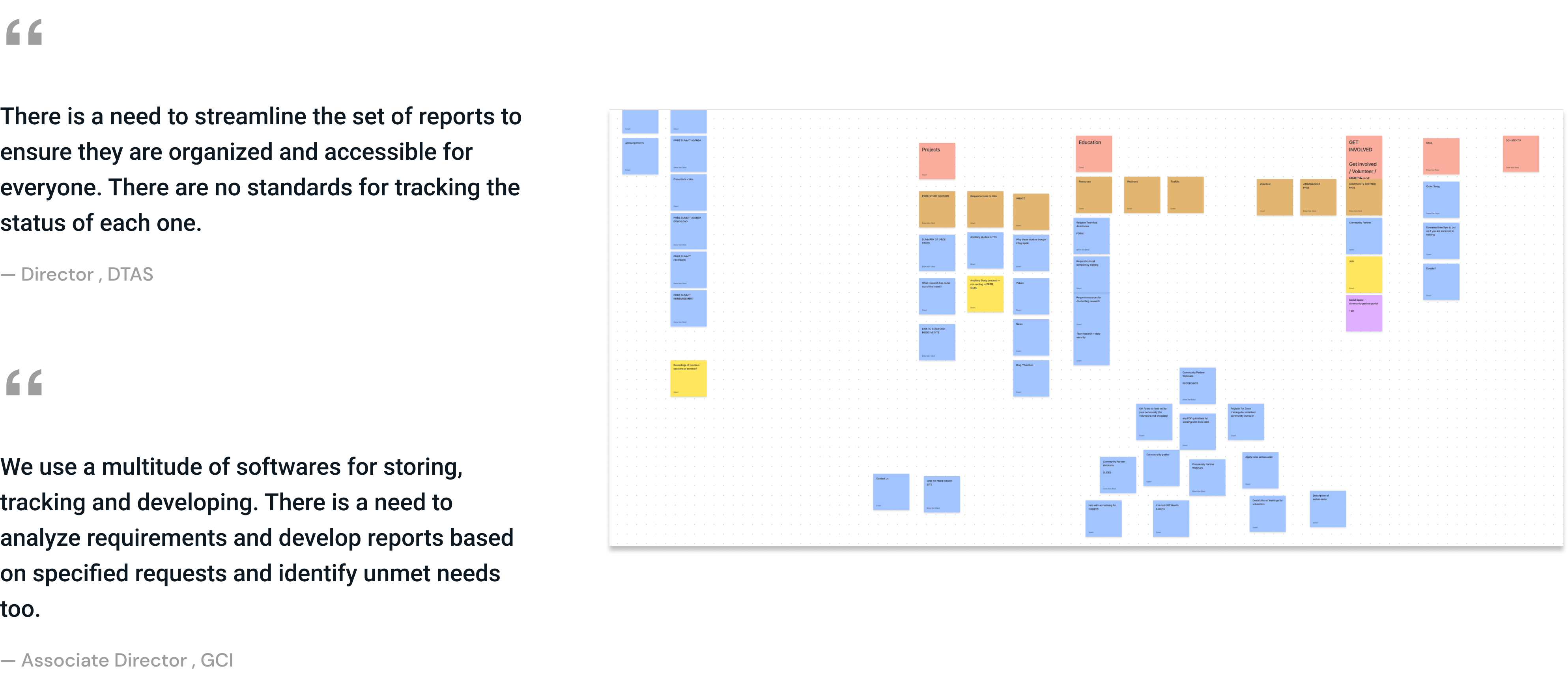
With the quantity of data we were dealing with, it was important to get a perspective from the executive team as well as the global Intelligence team that was reponsible for execution. We had to understand individual pain points and how people navigated with the system to find what they wanted.
We spent over two weeks with the team to understand the functionality and what the team hoped to achieve. The major aspects of what I learnt were:
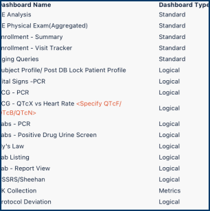
• The volume of dashboards being built on a monthly basis
• Following an agile method, each dashboard had multiple version at different stages of development
• Multiple developers worked on each dashboard, leaving behind multiple versions of each
• Most of the reporting tools were all built by outsourced contractors, so there was no proper handoff and takeover from anyone within Otsuka
• There were no long standing developers, so there was no accountability for maintenance after development
Otsuka was establishing the Data Tech team that would take over these tasks. To be able to design system that laid the foundation at the start, I had to understand the complex workflows of the multiple user types and their interactions with one another needed. In order to achieve that, I gathered as much as I could from the end users to understand the challenges they faced and how we could make a difference in optimizing pain areas.
After conducting countless user interviews, contextual inquiry and analyzing the gathered data, I was able to clear mark out the tasks that were required to be done.
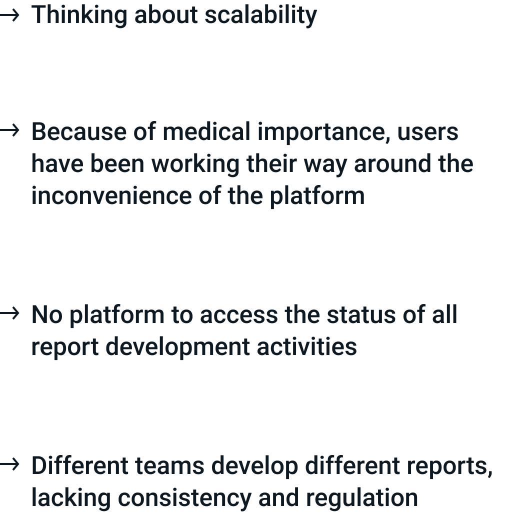
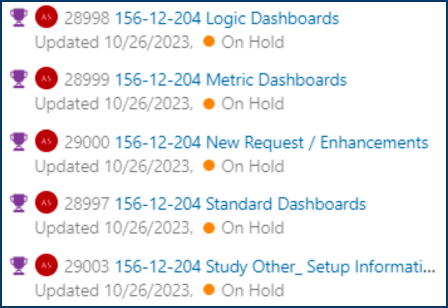
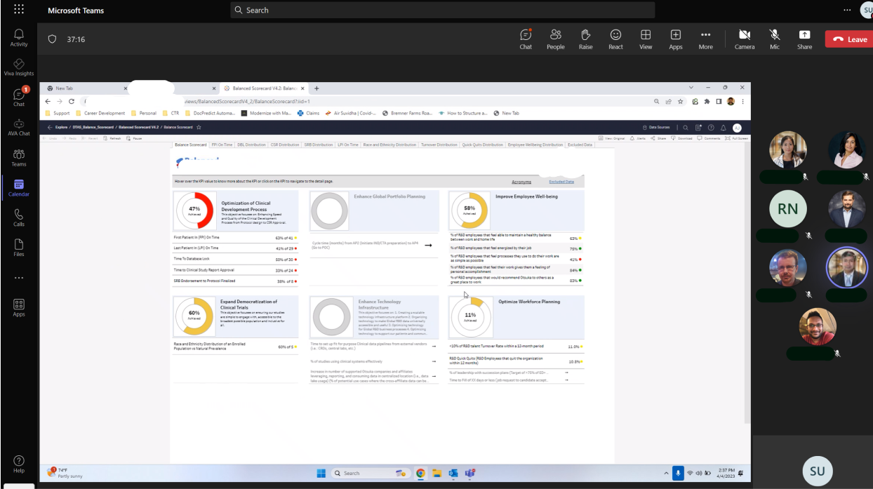
I learnt that the team used MS Azure DevOps to keep track of all their developmental activities. Most users were using it to check the status of development, who was responsible for what and to find the dates for the latest version of Dashboards. After much thought and discussion with the team, we decided to create a connection between the two.
#1:
Standardizing existing dashboards without changing the essence to avoid hinderance in the interim transition.
#2:
Reimagining & Developing Individual Dashboards based on requirements- Operations, Recruitment, Clinical Trials etc
#3:
Tracking portal to monitor the live status of all the Dashboards enabling easy navigation, tracking issues, identifying responsible teams etc.
Countless workshops with the team helped us decipher all the touchpoint they needed to be connected in this system.
We wanted to do away with the multiple manual tasks and proposed a solution to automate the entire process.
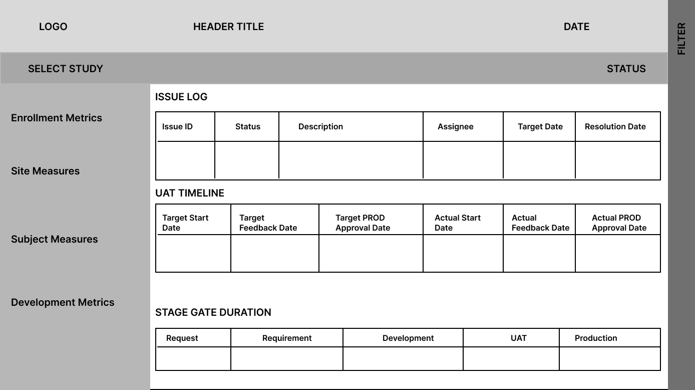
After gathering the requirements of the content needed, I developed lo-fidelity mockups to help users understand what we were designing for them. This really helped them visualize better and they were able to give me more feedback about what else they needed or would like to have.
Landing page - Overview

Detailed page - Overview
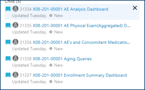
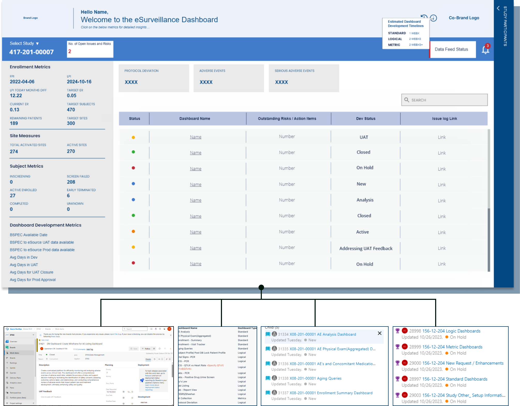
After developing and testing the lo-fidelity prototypes with the team, I fleshed out the entire high fidelity prototype, including all the feedback and minute details and worked with developers to execute the development. We essentially connected this reporting tool with MS Azure DevOps to help track the live status of all the ongoing and past development activities.
We included links to individual dashboards so the user wouldn't have to search for the right one. We also ensured links to an issue log that would give a detailed prognosis of everything that was happening with details of the troubleshooting team.
We did a usability testing with a focused group of users navigating the system trying to find the right dashboard. The key factors we wanted to address were - access to the latest dashboard, the updating of issues in delay, being able to see the team responsible for the development, and an overview of the timelines of development .
Here are the results we got:
8%
time saved to find the latest Dashboard
25%
time saved to access the information related to operations, issues and development
100%
Accuracy in accessing the correct dashboard